
Episode 10 of 16, 2025
ZeroZero
Mark, brand guidelines, social and print for an accounting firm
An accounting firm that looks as clear as the numbers it keeps.
Zero surprises, zero stress
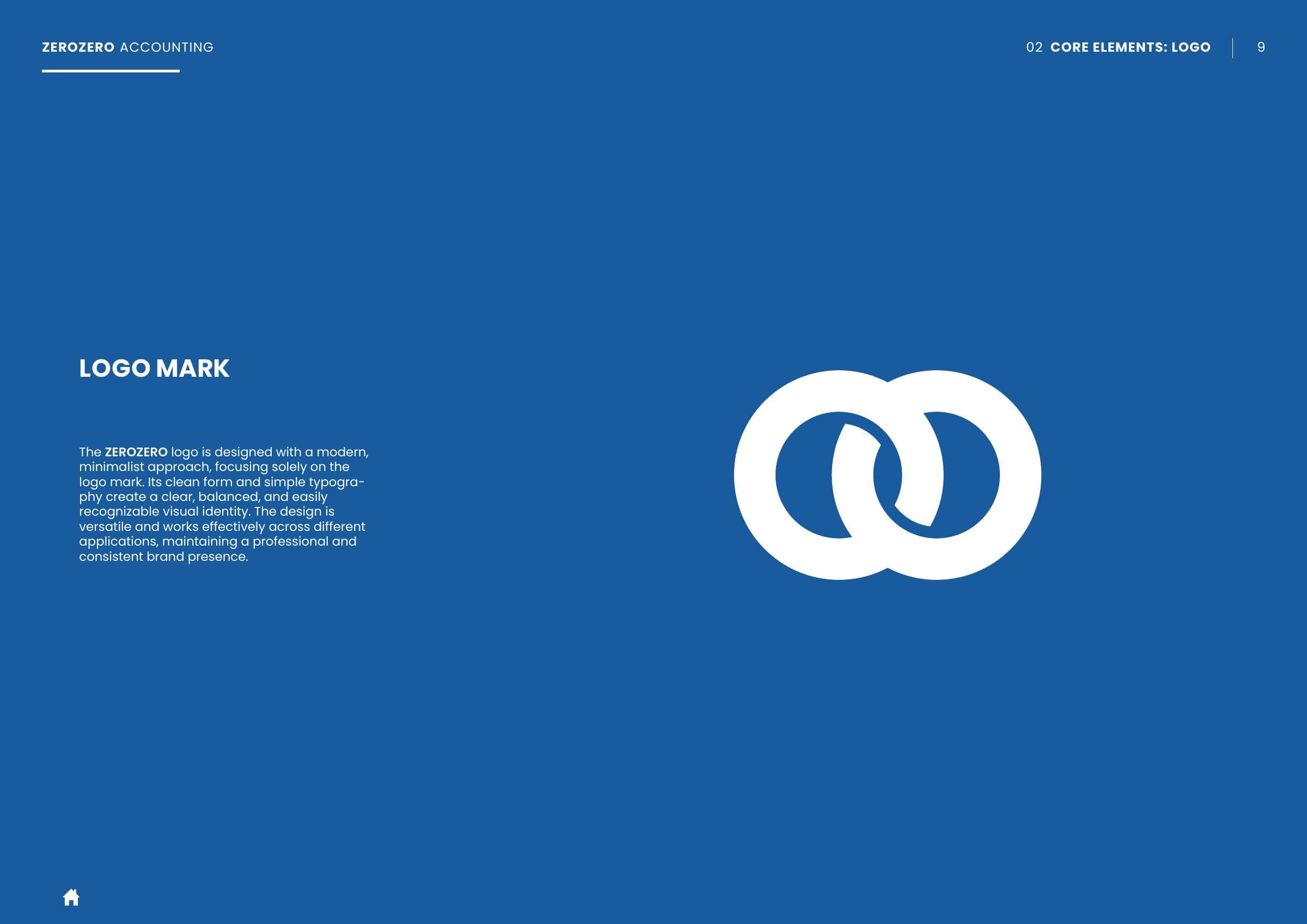
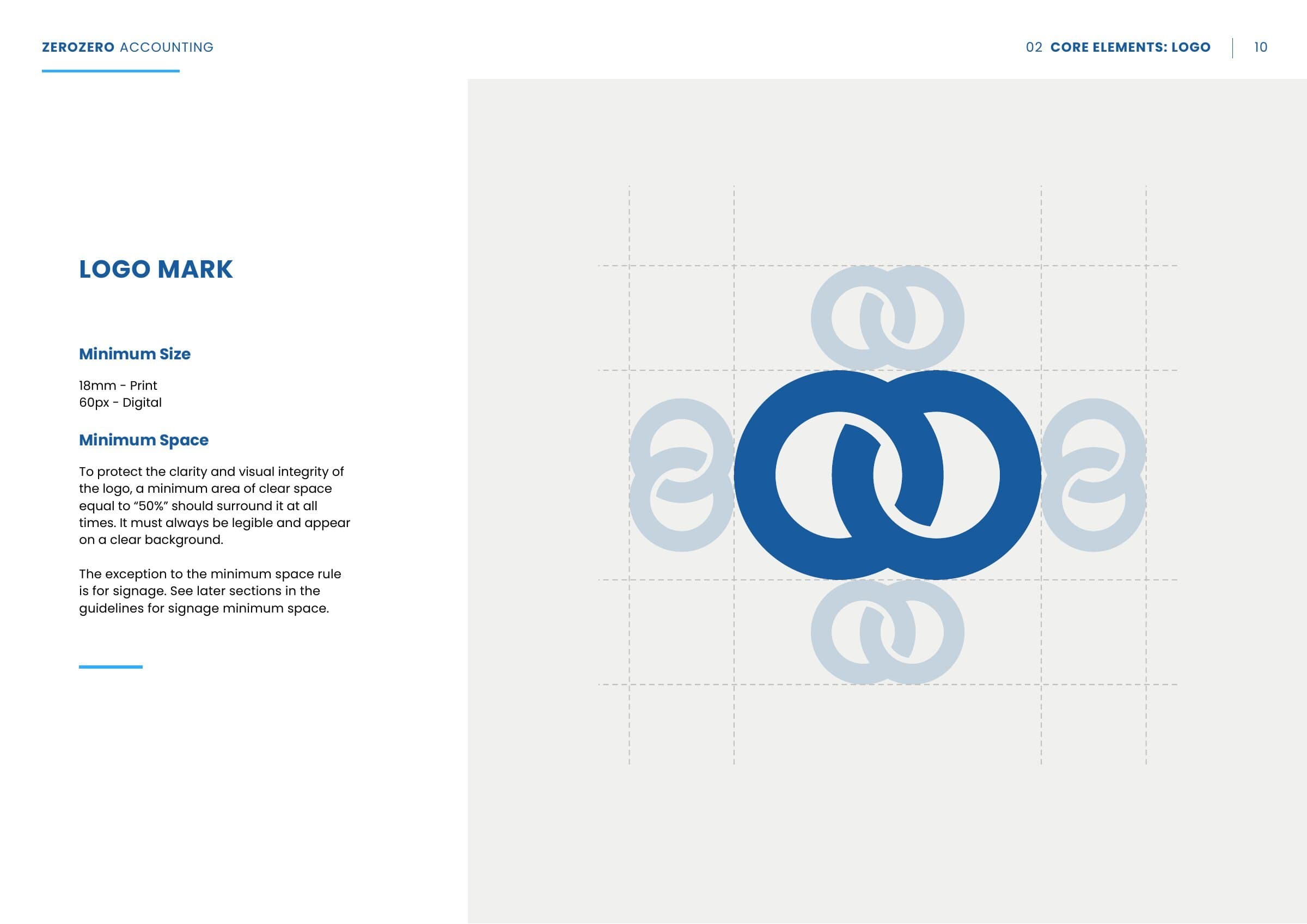
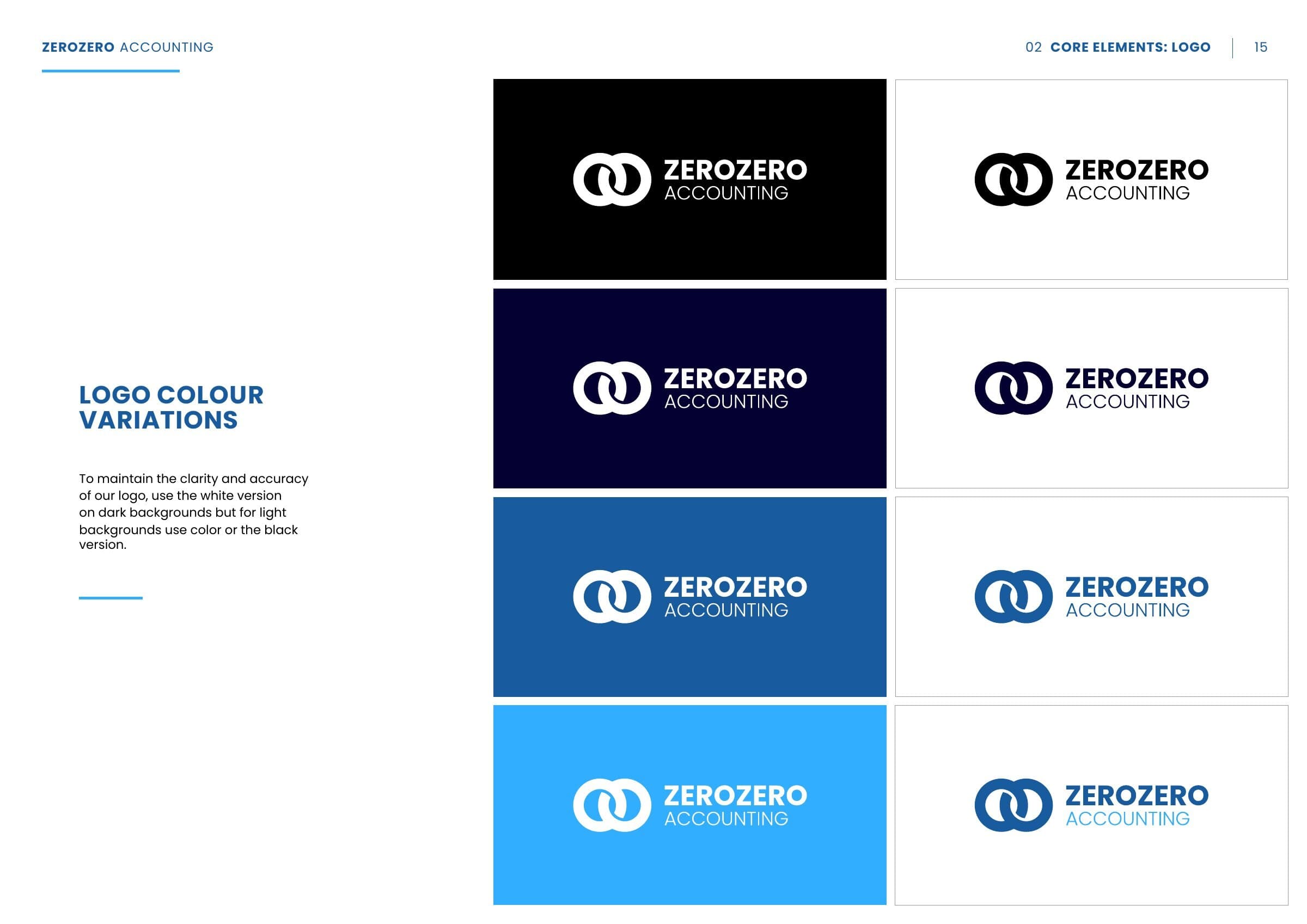
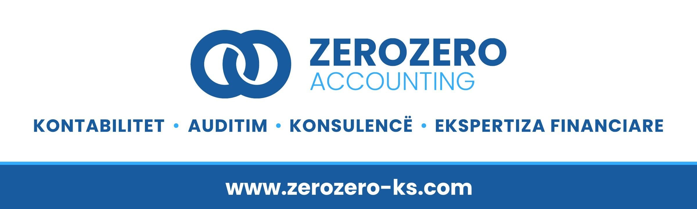
ZEROZERO Accounting was a new firm in Prishtina with a simple promise: zero surprises and zero stress for its clients when it comes to taxes and reporting. The name became the idea: two zeros, interlinked, form the mark, for balance, precision and two parties working as one.
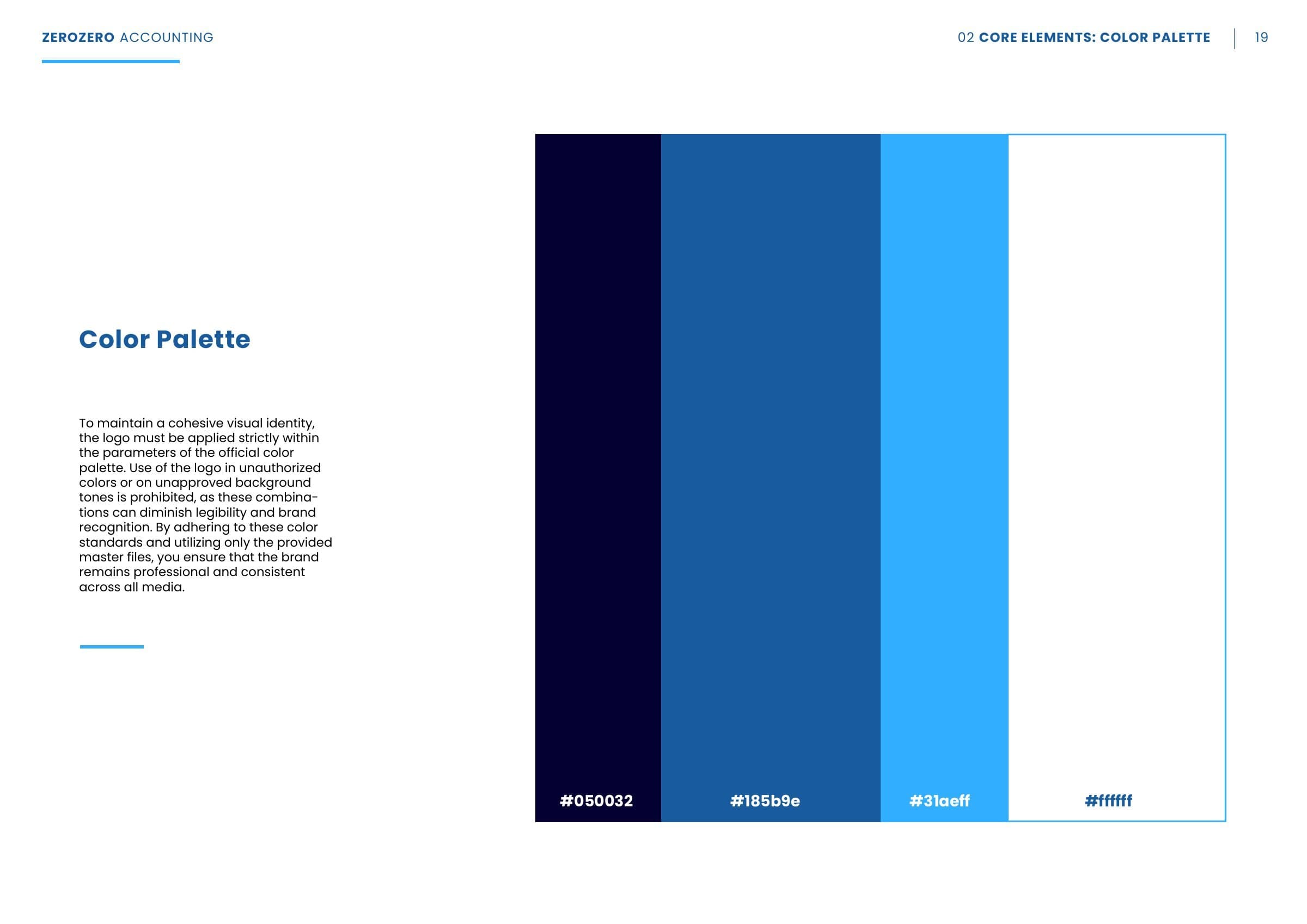
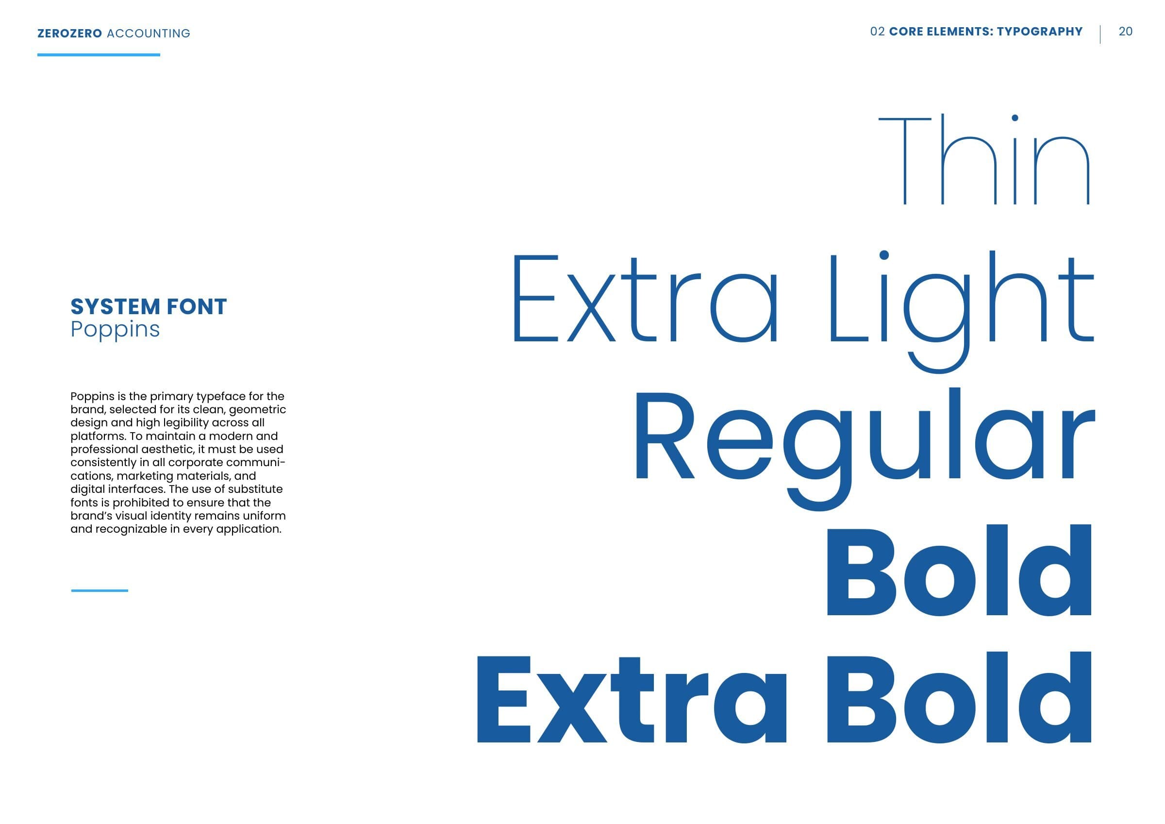
We built a calm, confident system around it: deep navy, brand blue and a light accent blue; Poppins from Thin to Extra Bold, so a headline can move from light to heavy in one line; and a photo style that keeps the client's people in sharp focus against cool, blurred offices. The 35 page guidelines set all of it down.


Four services, one launch
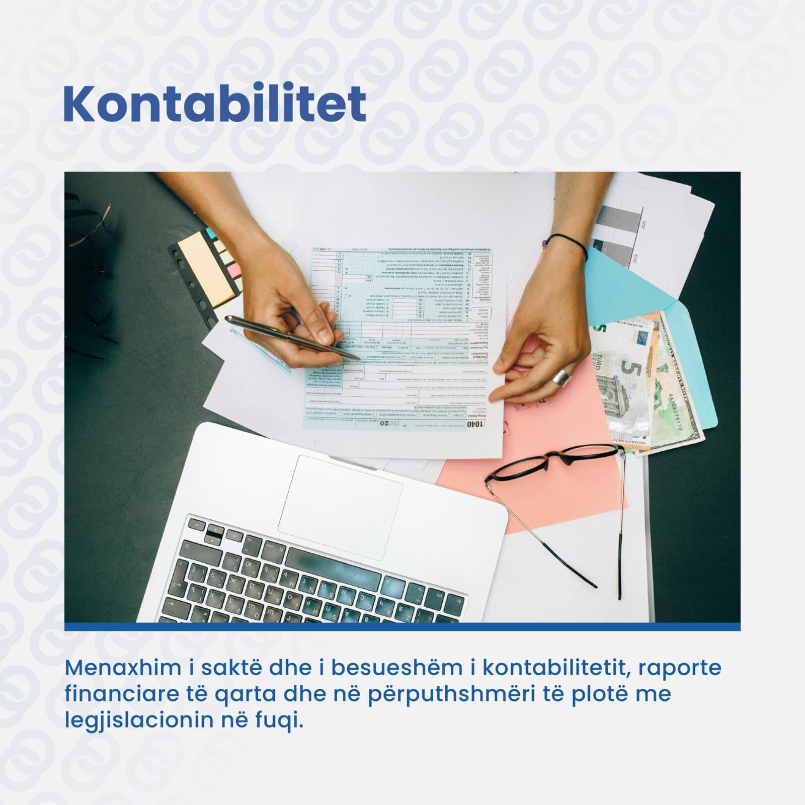
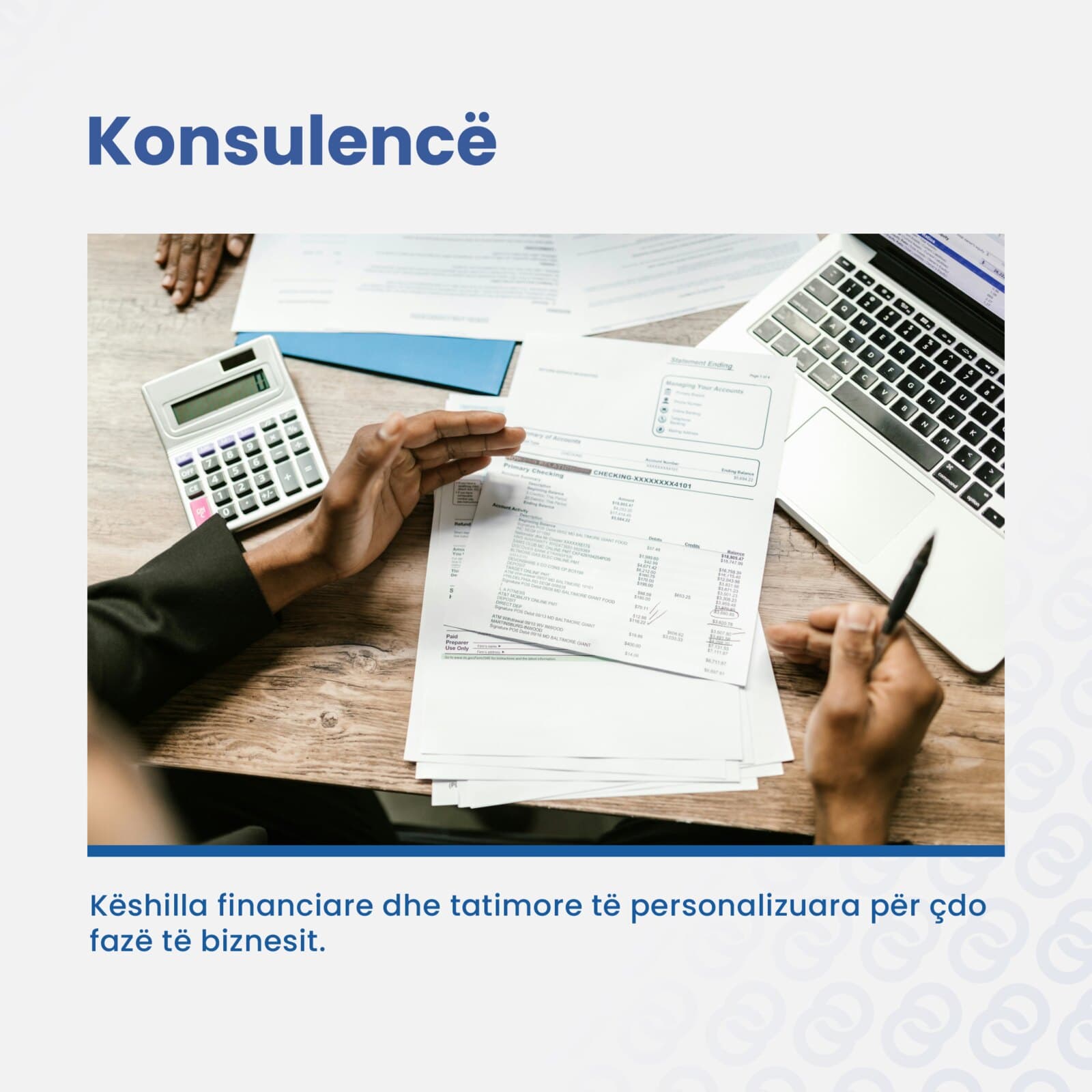
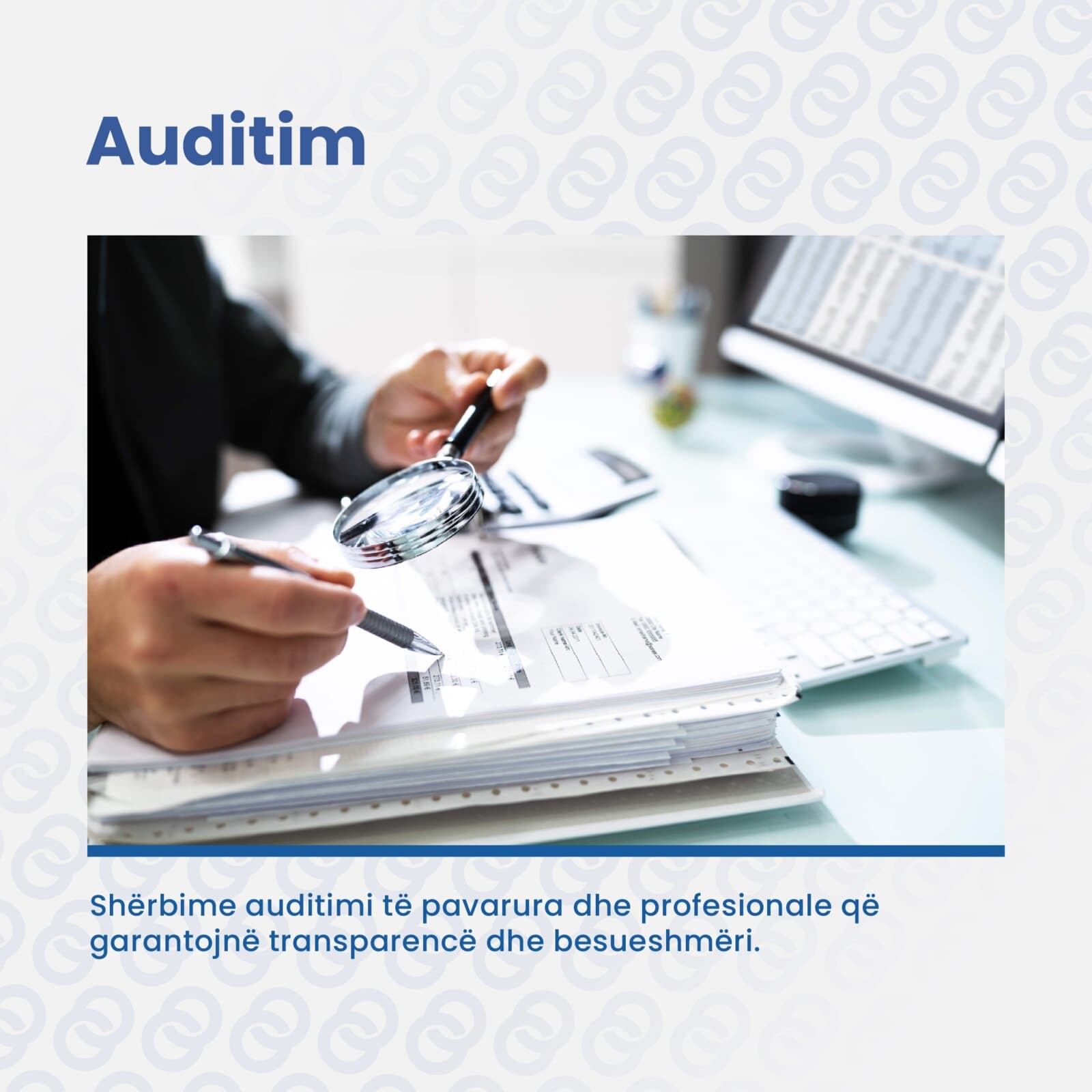
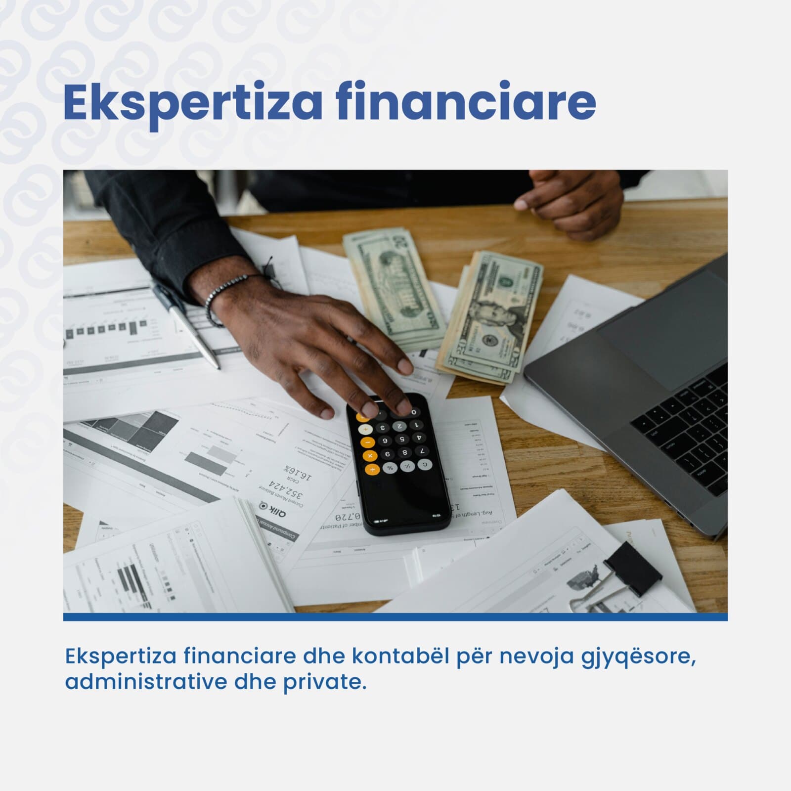
For the launch we designed a post for each of the four services, accounting, consulting, audit and financial expertise, with a launch post before them, a closing logo post after them, and the profile to hold them.


On paper and in the stands
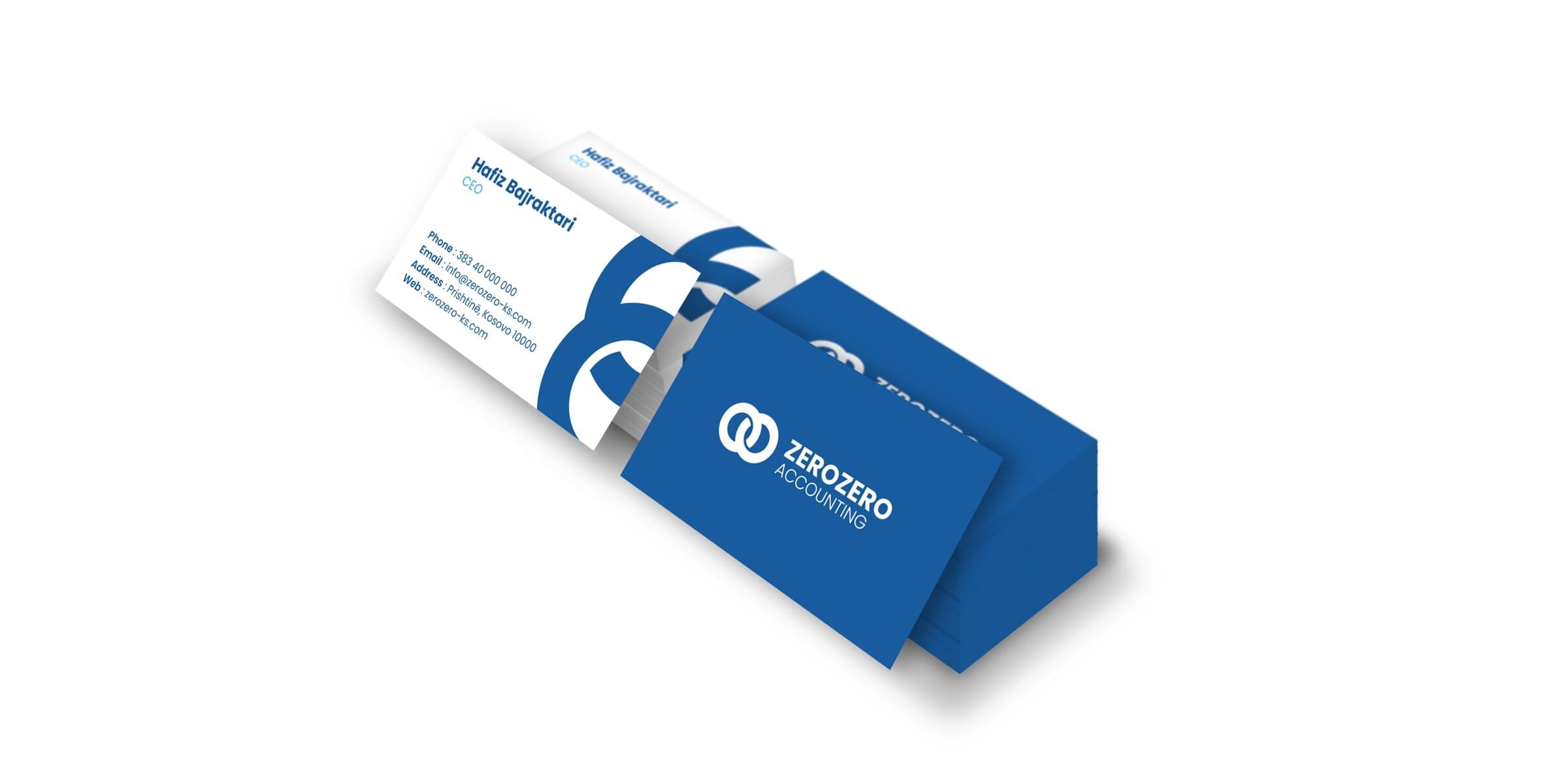
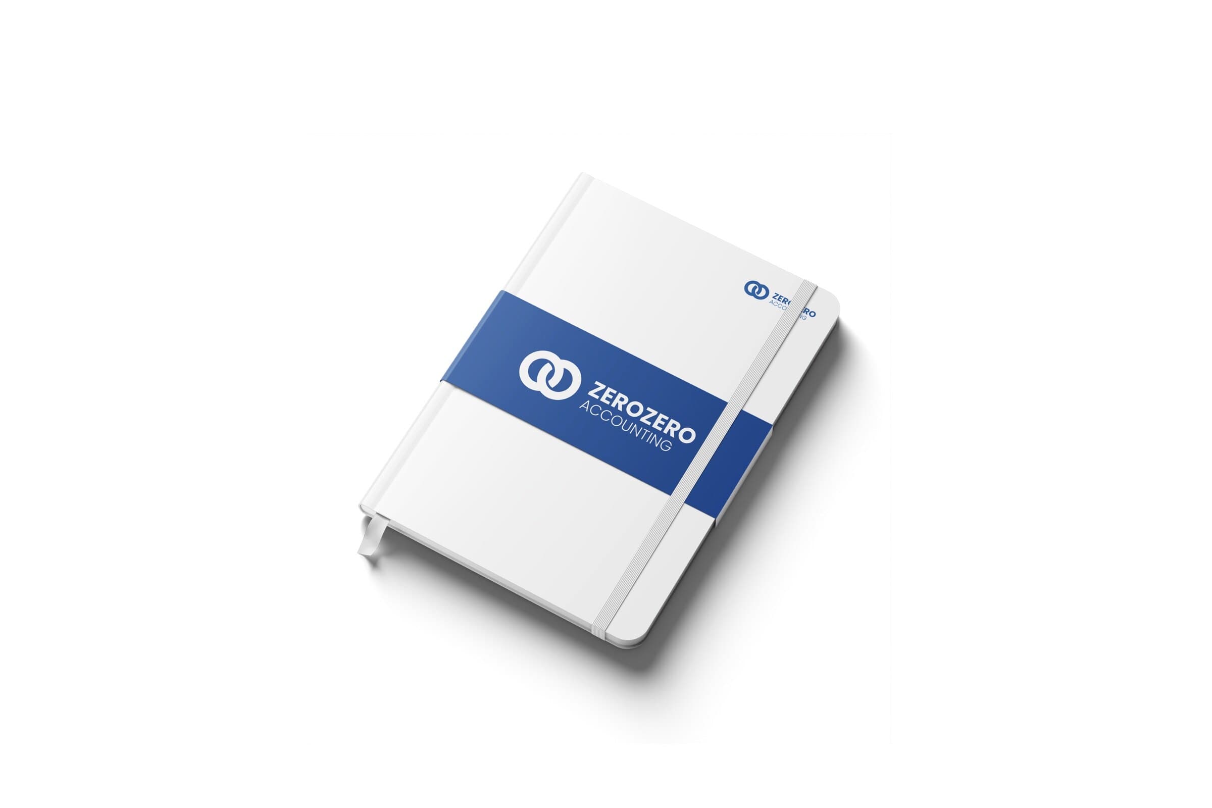
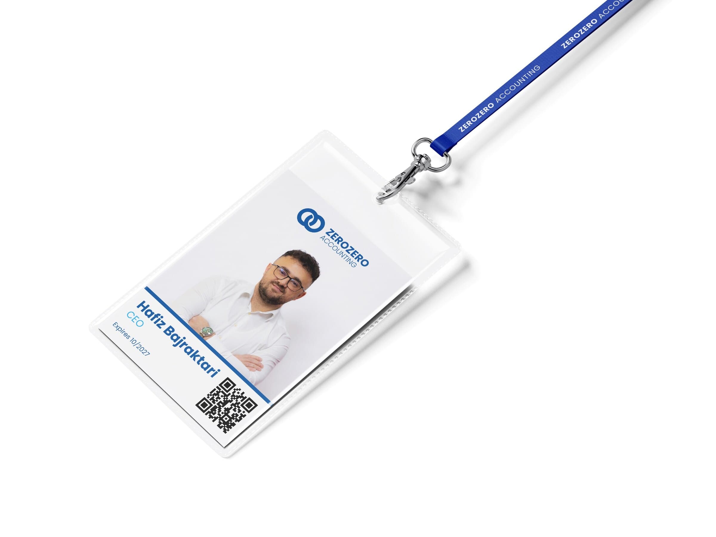
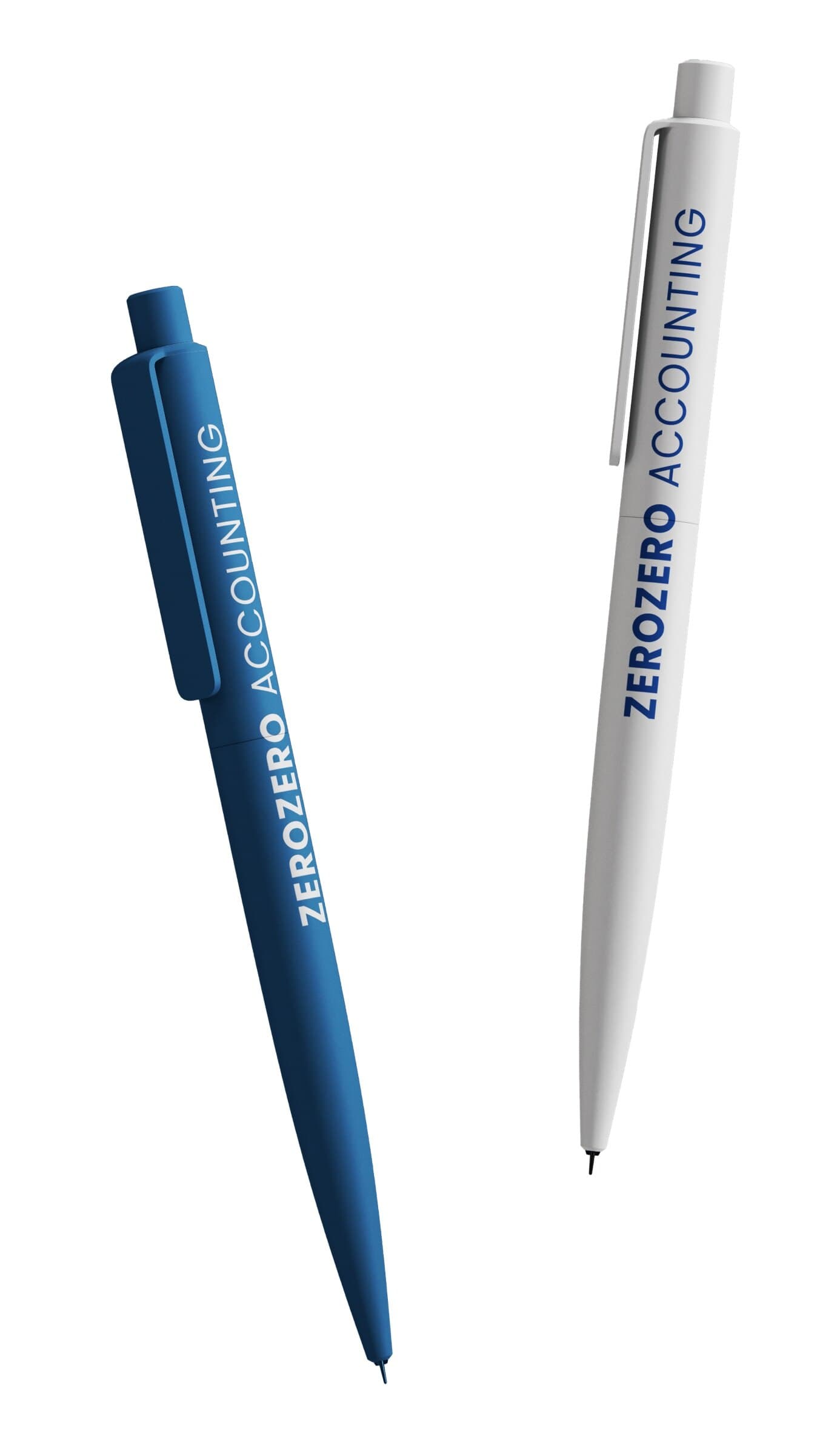
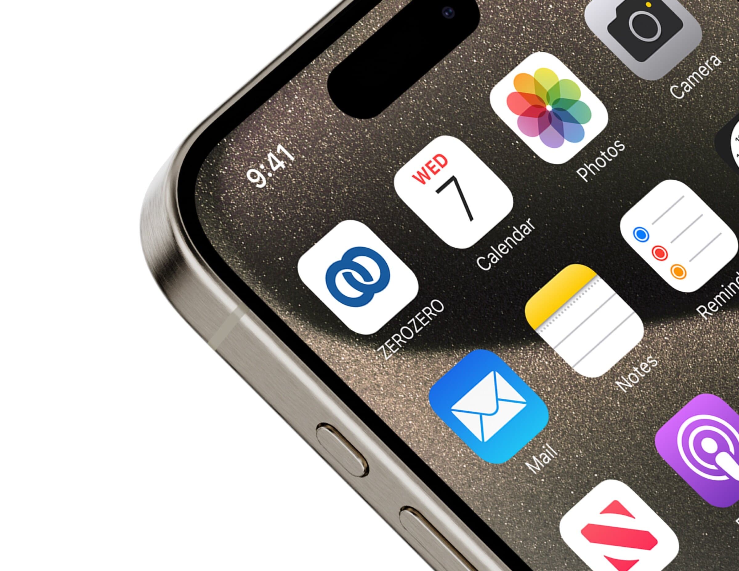
Then the identity rolled out to the everyday things, business cards, a notebook, an ID badge, pens and an app icon, and to large format print: a banner and a 3 metre board for the stadium.
Credits
- Client
- ZEROZERO Accounting, an accounting and financial services firm in Prishtina
- Year
- 2025
- Categories
- BrandingSocial mediaPrint and signage
- What we made
- The mark, two interlinked zeros, and the ZEROZERO ACCOUNTING wordmark
- Horizontal and vertical lockups, in colour and white, in SVG and PNG
- The brand platform and 35 pages of brand guidelines
- The palette, navy, brand blue, light blue and white, and a type system in Poppins
- The photo direction and layout grids, wide and narrow
- The Instagram launch: a launch post, four service posts, a closing logo post and the profile picture
- Business cards, a notebook, an ID badge, pens and an app icon
- A 120 by 70 cm banner and a 3 metre stadium board